Customizing Blacklight Tutorial Series (v7.11.1)
Bootstrap Styling
Blacklight uses the Bootstrap project as a base for UI components and it is added as a dependency during the Blacklight generator process.
Bootstrap allows for Blacklight adopters to easily style and enhance their applications, using DRY principles with minimal version upgrade pains.
When customizing the styling of a Blacklight application, first remove the application.css and create an empty application.scss file. This will allow you to take advantage of the powerful features of SASS, and rather than implicitly requiring all files in the app/assets/stylesheets directly, start explicitly importing ones that you need.
$ rm app/assets/stylesheets/application.css
$ touch app/assets/stylesheets/application.scss
Next, import the blacklight.scss into your application.scss file.
// application.scss
@import 'blacklight';
Your application should still look like the default Blacklight styling. Now let’s start to customize the theme.
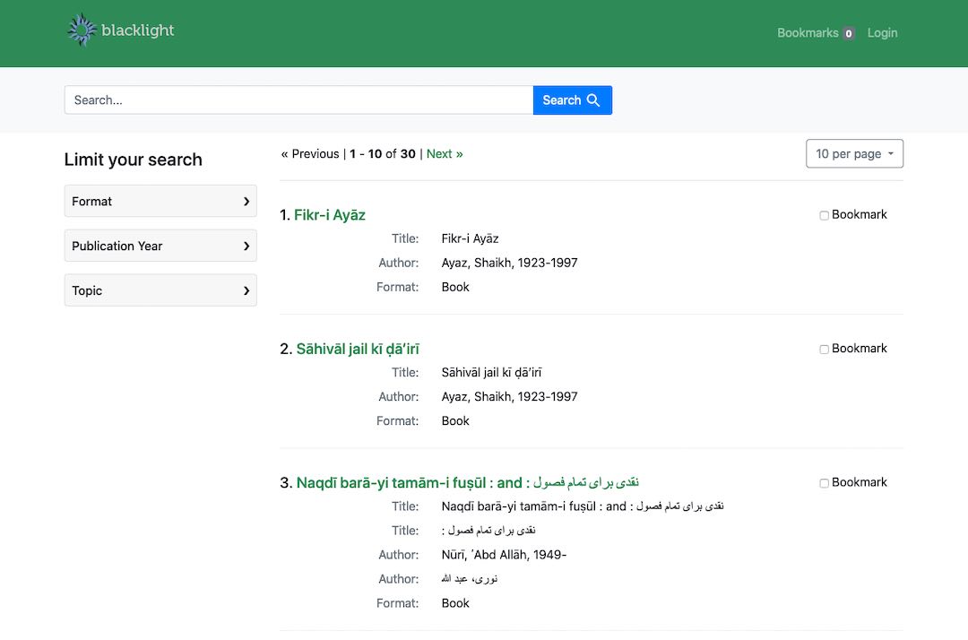
The Bootstrap framework allows you to update your application’s styling using variables, rather than overriding CSS. This helps for easier customization and longterm sustainability. One of the first thing customizations that organizations make is changing color schemes and the navigation bar. We will do this by adding some additional variable declarations to our application.scss file about the Blacklight import statement.
// application.scss
$navbar-padding-y: 24px; // Set a custom navbar padding to increase the size of the navbar
$dark: seagreen; // Set the dark variable to a custom one
$link-color: seagreen; // Also change the link-color to use the same color

@import 'blacklight';
Your application should have been changed so a search results page now looks like this.

This technique for customizing your application works on many different parts of the UI including: buttons, links, responsive breakpoints, and fonts. After many customizations the application.scss file can become crowded, so we usually split out our Bootstrap variable customizations into a new file, and just import that back into our application.scss.
// bootstrap-variables.scss
$navbar-padding-y: 24px; // Set a custom navbar padding to increase the size of the navbar
$dark: seagreen; // Set the dark variable to a custom one
$link-color: seagreen; // Also change the link-color to use the same color
// application.scss
@import 'bootstrap-variables';
@import 'blacklight';
A full listing of the variables that can be customized is available from Bootstrap’s GitHub repository. You can see how these are used throughout Bootstrap by searching for their usage in the codebase.